
The contents of this article are derived from the great work undertaken in this paper by Peter Flach and Meelis Kull at the University of Bristol, UK.
You’re probably familiar with these standard performance metrics for evaluating models:
- Precision – Proportion of correct positive predictions
- Recall – Proportion of positive labels the model predicted positive
- F1 – Harmonic mean of precision and recall
These metrics are useful, but they can be improved upon. This blog post introduces variants of these metrics called Precision Gain, Recall Gain, and F1 Gain. The gain variants have desirable properties such as meaningful linear interpolation of PR curves and a universal baseline across tasks. This post will explain what these benefits mean for you, how the gain metrics are calculated and outline some examples for intuitive comparison.
Motivation
Gain metrics have several advantages over their predecessors; we will highlight two of these for you in this section. The first derives from their linear interpolation property, which enables easier threshold selection, and the second derives from their universal baseline property, which enables fairer model comparisons.
1. It makes picking an operating point a dream (Linear Interpolation)
Take a standard PR (Precision-Recall) curve computed on your validation dataset shown below in Figure 1 (ignore the red circles for now). Assume you have been tasked with picking an appropriate threshold (operating point) that achieves maximum recall for at least 45% precision; what do you do? You most probably choose the last peak that exceeds 45% precision. But why restrict yourself to the peaks? After all, they are just an artifact of your validation dataset — it doesn’t seem very sensible. To hammer this point home, consider the drop in precision from 0.77 – 0.53 for an infinitesimally small reduction in your chosen threshold. Should you expect this small difference to have such a dramatic effect at inference time? Of course not. You know better than that.
The solution: Plot Precision Gain vs. Recall Gain (shown below in Figure 2). The red circles on both plots indicate the operating points corresponding to specific threshold choices ranging from 0 to 1 (the non-dominated points).


In PRG (Precision-Recall-Gain) space, linear interpolation between models is possible. Any operating point on the red dotted line can be achieved at inference time by flipping a coin with bias equal to how far between the two non-dominated points you are. Better still, you can map this linear interpolation back to PR space and pick your threshold. However, you may have noticed it is not trivial to spot which points are non-dominated in PR space which is why it’s critical to perform all calculations in PRG space.
2. Fairer model comparison (Universal Baseline)
The key message from the paper is that Precision, Recall, and F-score are expressed on a harmonic scale. Hence, any kind of arithmetic average of these quantities is methodologically wrong. This has real practical implications and means that traditional PR analysis can easily favor models with lower expected F1 scores. This was proven empirically in the paper on twenty-five thousand models. If you take one thing from this blog post, it’s that reporting the arithmetic average over F1 values is misguided, and so yes, it does mean you should throw out that macro F1 score! The good news is you can replace it with macro F1 Gain, but first, let me show you why an arithmetic average over F1 can be improved.
Assume you want to average F1 scores across three datasets (or folds) of 1k data points each, with positive class proportions of 1%, 10%, and 50%, respectively. Note this gives an averaged positive class proportion of 20.33%. The following table outlines some example F1 scores achieved on these datasets along with the corresponding F1 Gain values (see next section for how they are calculated).
| Dataset | F1 | F1 Gain |
| Dataset 1(1% positive class proportion) | 0.55 | 0.992 |
| Dataset 2(10% positive class proportion) | 0.75 | 0.963 |
| Dataset 3(50% positive class proportion) | 0.9 | 0.889 |
Mean Score | 0.733 | 0.948* |
*in non-gain space, this is equivalent to an F1 value of 0.83
The first thing you should notice is that the two approaches give different answers, an averaged F1 value of 73% vs. 83% when done in the non-gain and gain spaces, respectively. Our task is to see which one is closer to the expected value. If we make the simplifying assumption that precision equals recall, then we can get an indication of expected model performance by computing the micro F1 score.
TP = num_positives * recall = 10*0.55 + 100*0.75 + 500*0.9 = 530.5
FP = TP/precision – TP = (10*0.55)/0.55 – 10*0.55 + … = 79.5
TN = num_negative – FP = 2310.5
FN = num_positives * (1 – recall) = 10*0.45 + 100*0.25 + 500*0.1 = 79.5
Precision = Recall = F1 = 87%
This is closer to the macro F1 Gain score; however, micro averaging has shortcomings. I’ve summarized the pros and cons of the different metrics in Table 2 below. An important point to consider is what we desire from a metric. F1 is a good, widely used measure because it’s defined as the harmonic, and not arithmetic, mean of precision and recall. That means if either precision or recall is small, so is F1, a desirable property because a large value for one measure cannot hide poor performance in another. Similarly, it’s desirable to have that same property when averaging across datasets.
| Metric | Pros | Cons |
| Macro F1 | – Easy to compute | – Doesn’t take class balance into account – Hides poor performance |
| Micro F1 | – Not always possible to compute – Takes class balance into account | – Hides poor performance |
| Harmonic Macro F1 | – Easy to compute – Doesn’t hide poor performance | – Doesn’t take class balance into account |
| Macro F1 Gain | – Easy to compute – Takes class balance into account – Doesn’t hide poor performance |
Gain Metrics
Ok, I’m interested in switching, but what are these magical gain metrics? Most simply, they are defined by the following transform.

Why this transform?
Precision-Recall analysis differs from classification accuracy in that the baseline to beat is the all-positive classifier instead of a random classifier. This baseline has precision = π and recall = 1. It can be easily seen that any model with precision < π or recall < π loses against this baseline. Hence it makes sense to consider only precision and recall values in the interval [π, 1]. Any real-valued variable 𝞆 ∈ [min, max] can be rescaled by the mapping ƒ(𝞆)= (𝞆-min)/(max – min). However, the linear scale is inappropriate as we should use a harmonic scale instead, hence map to:

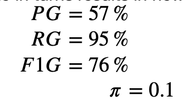
To show you how to use the transform in practice, consider a binary classification dataset with a positive class proportion of 10% and a model that makes a correct prediction on a datapoint 70% of the time independent of class. In traditional PR analysis, the metrics are computed as follows:

Applying the transform to each metric in turns results in new gain metrics of:
Note F1G can also be computed directly from the arithmetic mean of PG and RG:

Interpretation
How does one interpret these new metrics? Let us look at an example. If I said a model had an F1 score of 0.6 and asked you if it was good, you would be hard-pressed to say anything confidently without more information. Why? Because if the validation dataset had an even class distribution, then achieving an F1 score of 0.67 could be done simply by always predicting positive (Precision = 0.5, recall = 1). A model that achieves 0.6 is terrible. However, if the positive class occurs only 1% of the time, 0.6 could be considered good. After all, the baseline all positive classifier only achieves an F1 score 0.02 (Precision = 0.01, recall = 1).
What about if we had used gain metrics instead? The baseline for the all-positive classifier is universal, so for both datasets, it’s equal to 0.5 F1G (Precision Gain = 0, Recall Gain = 1). Note on the PRG plot the baseline corresponds to the minor diagonal. Any model scoring an F1G greater than 0.5 is better than random; in other words, any model with PG + RG > 1 is better than random. Table 3 below shows the equivalent F1G metrics for a model scoring F1 = 0.6 on each dataset, as discussed in the previous paragraph:
| Dataset | F1 | F1 Gain |
| Dataset 1(50% positive class proportion) | 0.6 | 0.33 |
| Dataset 2(1% positive class proportion) | 0.6 | 0.99 |
You can see a model that achieves an F1 score of 0.6 on a skewed dataset is far superior to a model that achieves an F1 score of 0.6 on a balanced dataset. Gain metrics are the sensible choice when comparing models with an easy-to-understand baseline. A 0.6 F1G is always better than random; the same cannot be said for an 0.6 F1 score.
Now the eagle-eyed amongst you might have realized these metrics can go negative. So what does a negative gain metric mean? Just that you’ve trained a terrible model. A negative value arises when your traditional metric is smaller than the positive class proportion. In the extreme case of zero true positives, the gain metrics will tend towards the limit of negative infinity.
Concluding remarks
Hopefully, this blog post has convinced you to at least try out Precision Gain, Recall Gain, and F1 Gain. I’ve provided sklearn-friendly Python code to help you incorporate these new metrics into your workflow. Remember, it’s straightforward to convert back and forth between gain and non-gain metrics, so the barrier to entry is small. A final request would be if you found this post interesting, please do share it with your friends and colleagues. Happy coding!
Code

Recommended articles
View all articles

Grok 4.5 Testing Results: How SpaceXAI’s New Model Performs on Real Professional Work
We’ve evaluated Grok 4.5 on Snorkel’s GDPval+ dataset, Snorkel’s expert-created dataset of professional workplace reasoning tasks from across the economy. To compare performance against other frontier models, we ran the evaluation alongside GPT 5.5 and Claude Opus 4.8. Overall, Grok 4.5 demonstrated the strongest overall performance. Dataset GDPval+ is part of the Snorkel Data Series (SDS), Snorkel’s portfolio of expert-curated
July 8, 2026
•

Agents’ Last Exam: AI Benchmarking for Real Work
At our latest Snorkel AI Reading Group, Yiyou Sun and David (Xinyang) Han (UC Berkeley, Center for Responsible and Decentralized Intelligence) presented Agents’ Last Exam (ALE) — a benchmark designed to evaluate AI agents on long-horizon, economically valuable, real-world tasks with verifiable outcomes. ALE is a collaboration between Berkeley RDI, Snorkel AI, and 300+ expert contributors across 55 professional subfields. ALE asks a deceptively simple question: can
June 30, 2026
•
Snorkel Team

Continual learning and evaluating how AI agents learn across sequences of tasks
Most agent benchmarks evaluate each task as an independent episode. The agent receives a task, produces an answer, gets scored, and moves on. The next task starts as if the previous one never happened. That setup misses a core requirement for deployed agents. A coding agent, research assistant, data analyst, or workplace assistant should improve as it works across repeated
June 29, 2026
•

